Duration: A week
Participation: Solo work for a board of clients

Originally, or should I say orange-inally, I started with a orange, white and black colour palette because those are the colours that the club had previously used. However, when discussing the direction of the club and their plans for the future, I learnt that they were planning on expanding their reach and wanted more ethnicities to feel welcome. The club would be changing from The Rembrandt Dutch Club to The Rembrandt Social Club. This move was made due to the limitations and pressures of the pandemic.
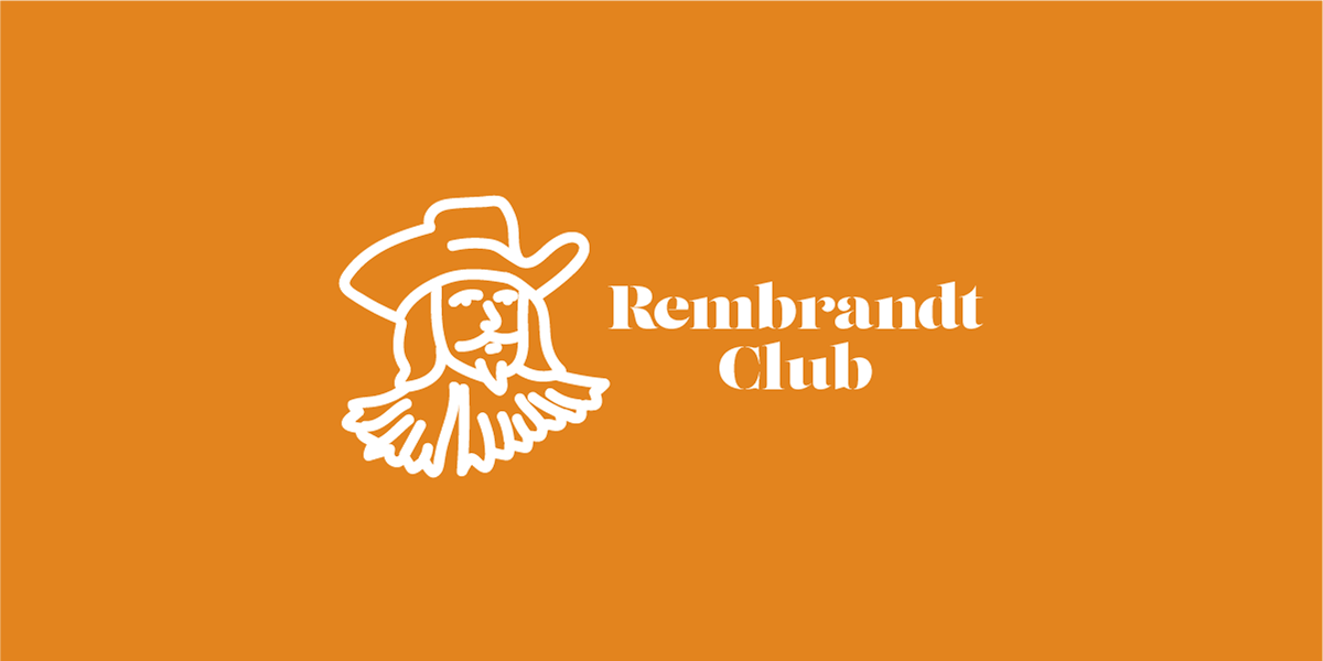
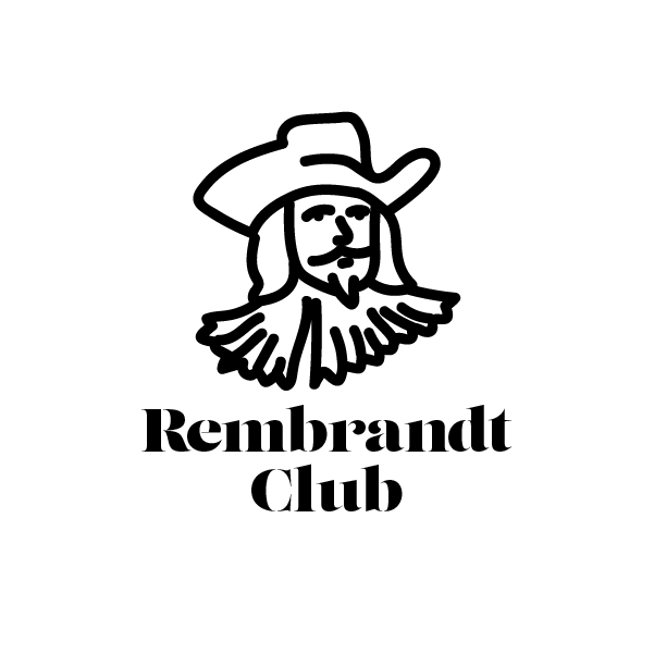
My original logo.
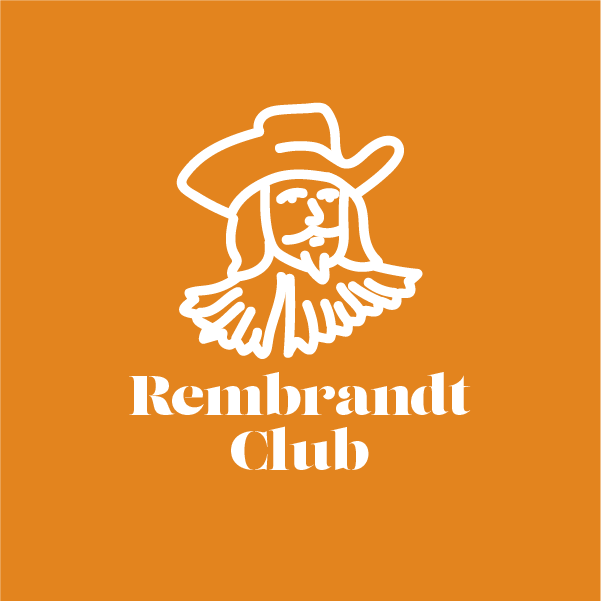
The logo in an upright orientation which can be used as an avatar. For LinkedIn or Facebook as an example.
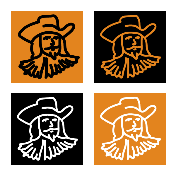
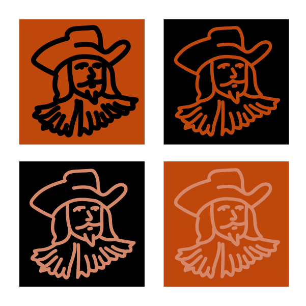
A Black-and-white variation (left) and a grid of alternative variations (right).

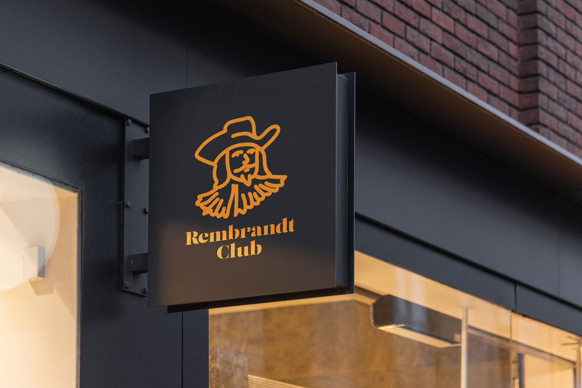
The orange logo seen in cafe-relevant mockups.
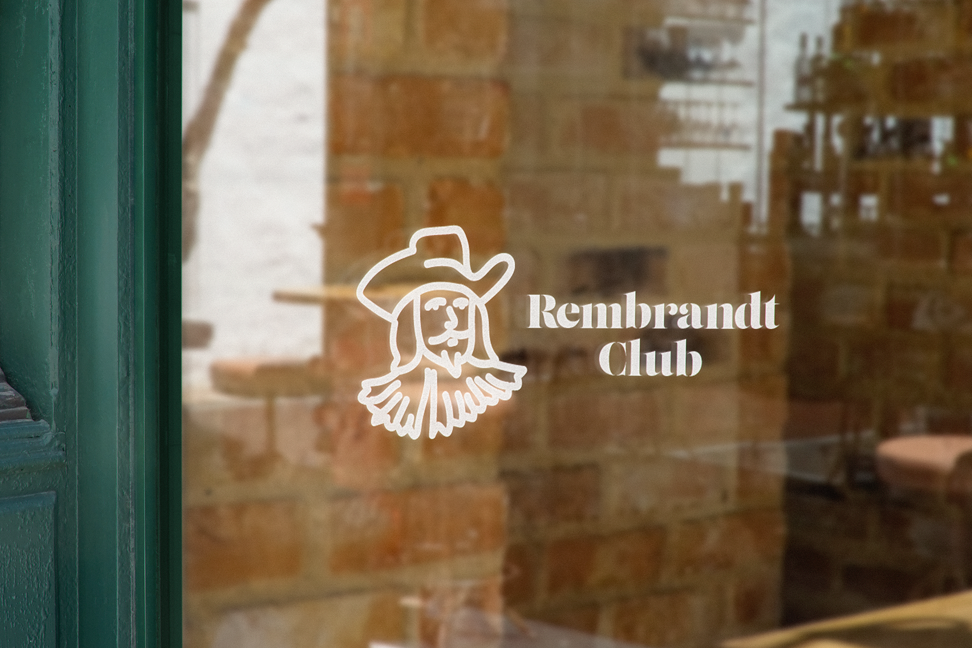
The white landscape logo on a shop-front window.

A dark-orange / red variation - in light of the club's movement towards other demographics. The white is substituted for pink to give a more muted feel.

Variations were also made for the new colours, however, they were not strong enough so were not shown to, or considered by the client.
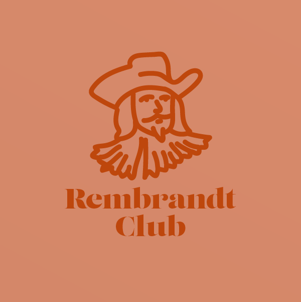
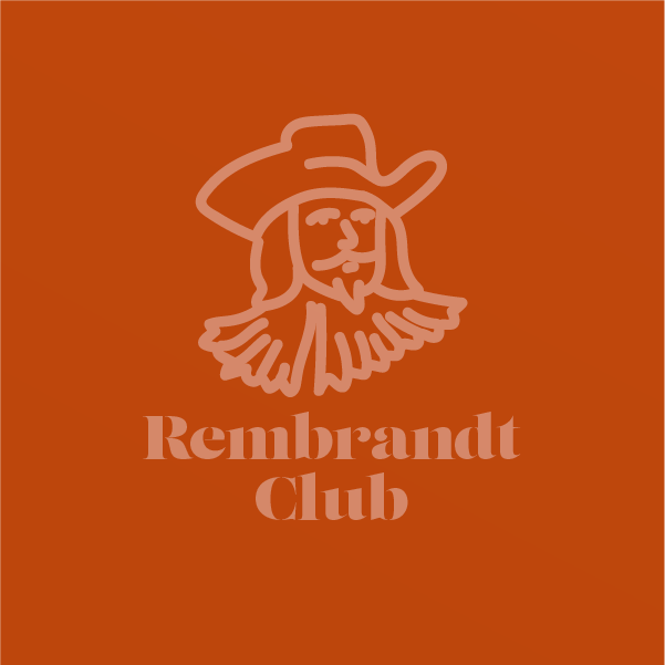
The upright logo variations using the new chosen colours.
In the end, the Rembrandt Club has been struggling with the recent lockdown and will not be re-branding at this stage. They view it as a risky and un-rewarding venture due to their industry (cafes) being non-essential and therefore closed.